Tutorial

THEORY | Understanding Colour

It doesn’t matter whether you are a traditional artist, or a digital one, colour theory sooner or later will have to interest you. All too often we pick colours we love, but sometimes the result just won’t look very good. This is where the basics of colour theory come in handy. You might already have read some of my ‘Applying Colour’ tutorials, in which I work with selected colour schemes, yet this tutorial is all about that little step before choosing the scheme and colours. I know it’s very theory based, but I’ll try to keep it short and sweet.

The Colour Wheel

I am very sure you have seen this kind of colour wheel in one form or another before. Without going on about  too much of its history (which is interesting nevertheless), I want to talk about its usefulness. The colour wheel simply is a tool for the artist and rather than just displaying the colours, it also shows the relationships between them as well. Are you stuck when choosing colours? Take a colour wheel and decide what colours to use.

This colour wheel is based on the RYB-model, on red – yellow – blue. I know that not all colours in existence are on this wheel, but I will get to that later.

A tutorial on colour theory.
Primary, Secondary & Tertiary Colours

Some might be thinking, great I have a wheel with colours, but how do I read it? It’s not very difficult to understand, when you break it up. I positioned the primary colours (red, yellow and blue) in the middle of the circle. Primary colours cannot be mixed, hence their given name. All the other colours originate from mixing primary colours with another primary or non-primary colours.

A tutorial on colour theory.

 
Next in line are the colours situated on the grey circle, which are called secondary coloursA secondary colour is created when two primary colours are mixed. For example, when mixing red with yellow, the result will be orange.

On the outer circle is the last type of colours, the tertiary coloursTertiary colours can be created by mixing a primary with a secondary colour. Generally, the tertiary colours have the greatest variety.

A tutorial on colour theory.
Tints, Shades & Tones

Having the bare basics of colour mixing down I want to go to the next step. So far all the colour examples were bright and saturated colours, though we know there are far more available like pastel colours or greyish ones. This is the domain of tints, shades and tones. These colour concepts complete our sense of known colours.

  • tint is created when a colour is mixed with white (e.g. red + white = pink).
  • shade is created when a colour is mixed with black (e.g. orange + black = brown).
  • tone is created when a colour is mixed with grey (e.g. red + grey = mauve taupe).

While talking about colours; white, grey and black are considered neutral!

A tutorial on colour theory.

 
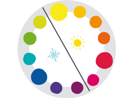
Now there are two types of colour concepts to put together for our complete view of available colours, the colour wheel with its colour relationships and the tints-shades-tones concept. A (more or less) good visual representation can be found in digital drawing software, which I find useful for explaining how to combine these two concepts. The picture below is a screen shot of the colour wheel available in Painter. On the outer ring there is the colour wheel  just as described at the beginning of this tutorial. In the middle is a triangle, which is all about the tints, shades and tones.

It’s really easy to work with. The general colour can be picked on the outer circle, in this instance a pinkish colour (tertiary). Grey is added to tone it down. When thinking about how and what colours to choose, this visual aid might be useful.

A tutorial on colour theory.

 
I hope this little tutorial did help you to understand colours better and there is no reason being overwhelmed by their variety. Until next time.

 
© Aileen Strauch, first published on the Letraset art blog in 2013