Tutorial

THEORY | Light & Shadow

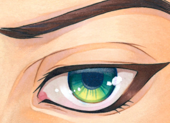
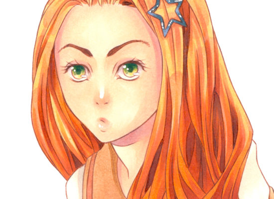
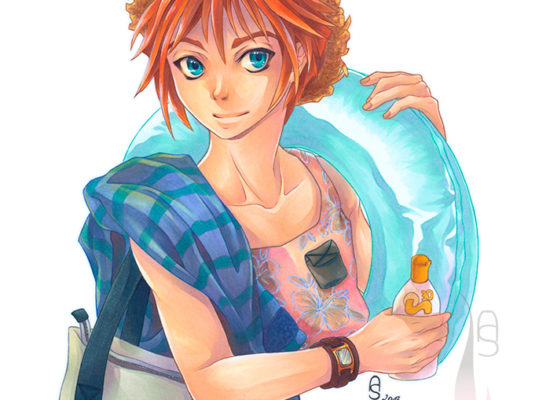
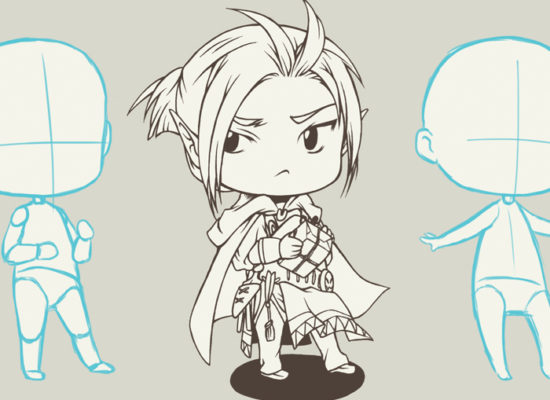
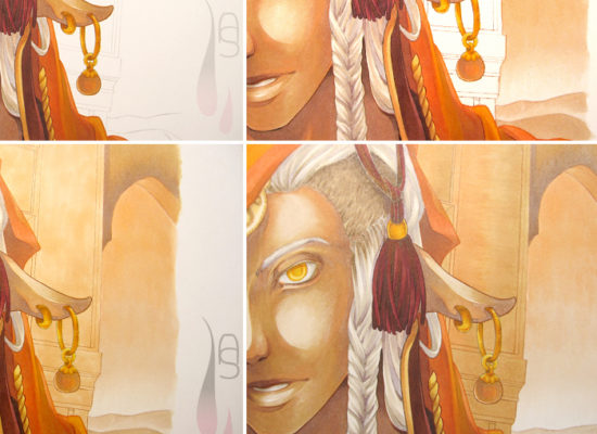
No matter how stylised or realistic your approach to your artwork is, it still needs to follow the physics of light and dark. It is innate to the human eye to pick up on irregularities of light and shadow, even if we can’t point out exactly what is wrong.

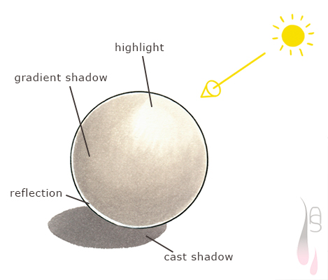
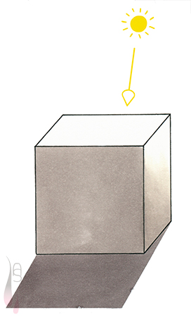
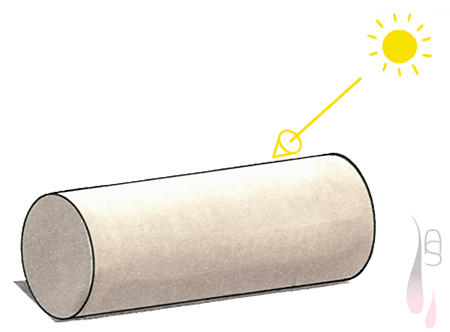
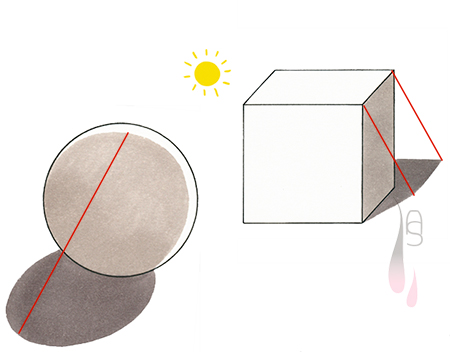
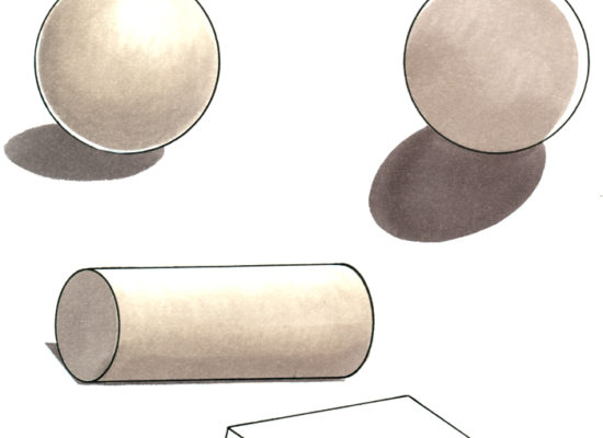
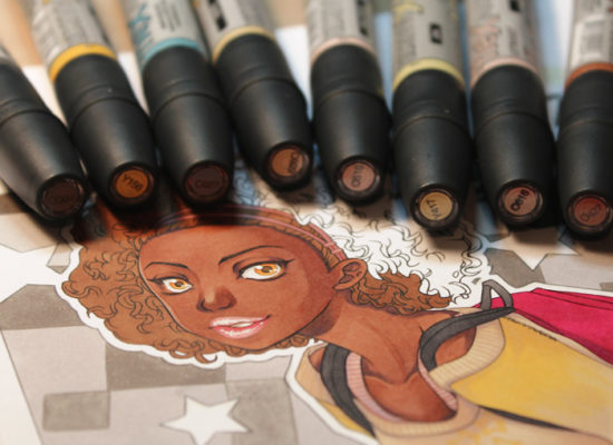
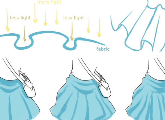
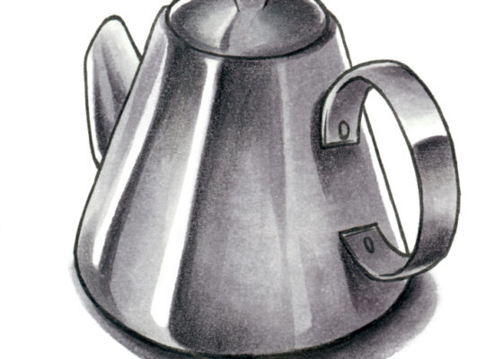
When it comes to shading, you should think about the distribution of light and shadow. If you have difficulties in visualising how to lay down shadows, try to simplify the shape. Pick the direction of a light source and stay true to it. In this little example below you can see the light coming from the top corner and due to the curved surface, the shadow on the ball gradually darkens to where less light hits it. On the ground you can see the cast shadow from the ball. Now there is one more component, the reflection. Light usually travels in a straight line and would never hit the back of a non-transparent object. Why add a reflection? Light bounces off surfaces, the amount depends on the colour (lighter or darker) and on the texture. Obviously a light and very smooth surface reflects more light than a dark and bumpy one. These are the bare basics to consider about reflections.

A tutorial on light and shadow.

 
Now that I have covered a round surface, how about one with edges?  In this example the light hits more from the top and due the box shape, sharp shadows appear on the surface mainly on the side opposing the direction the light comes from. A gradient shadow is only visible on the side where some light still manages to hit the surface.

A tutorial on light and shadow.

 
Not all shapes fit into one of the two categories above, but are a combination of the two. The same goes for the shading of a cylinder in this case. Wherever you have a curved surface, it is more than likely to have a gradient shadow on it. Yet you will have a sharp edged and ‘flat’ shadow on either one of the sides.

A tutorial on light and shadow.

 
Of course there are many types of lighting and it is always crucial to the tone and appearance of an image. It is something important to think about before starting to colour. The ball below features the so called rim lighting, which can be used in a very atmospheric way and is often used for darker scenes with impact. The cube however looks as if it is caught in direct sunlight, which casts a strong shadow. It has a much lighter look overall.

As you can see, the impression changes instantly according to the use of light and shadow, and the direction the light is coming from.

A tutorial on light and shadow.

 
Having read all that you might wonder ‘why did she talk about balls, cubes and cylinders’? Although very few things in life look exactly like these three shapes, they can help you to simplify complex shapes. A prominent example would be the human shape. We all know what it looks like, but it can be hard to shade. Well, if you think about the human form in terms of a ball and cylinders, it should be easier for you to visualise where to put down shading.
I hope my little light and shading talk was informative. Until next time!

 
© Aileen Strauch, first published on the Letraset art blog in 2014