Tutorial

BASICS | Metal Texture
  • tool: markers + coloured pencils
  • difficulty: medium

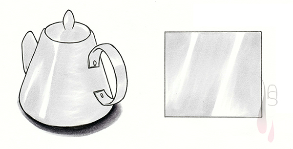
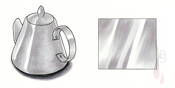
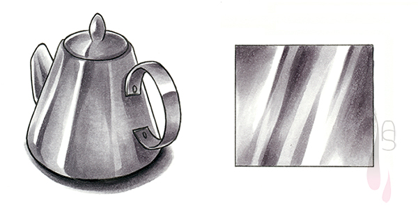
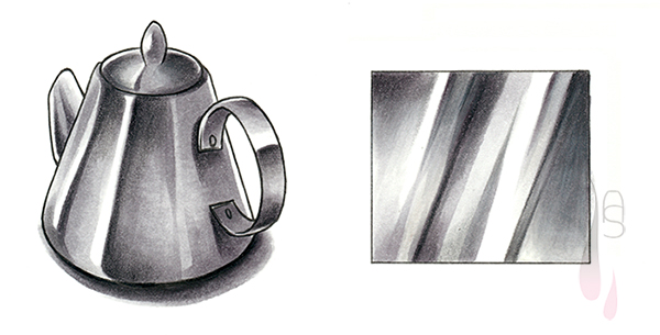
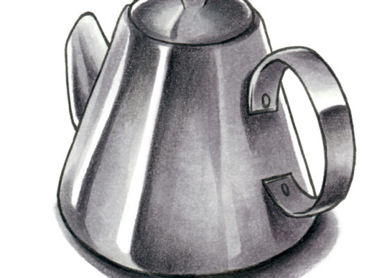
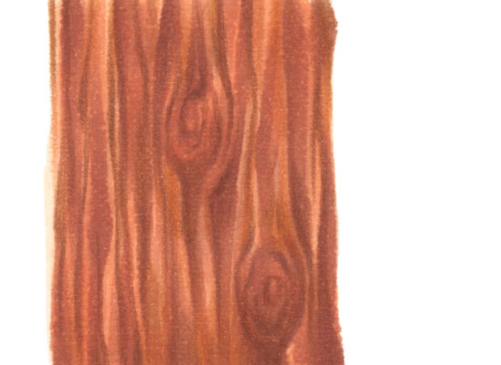
Hello and welcome to another tutorial on surface textures. Having covered wood in a previous tutorial, I wanted a different kind of texture and finish, metal. Just like wood, metal comes in many variations and so does the surface texture. Metal can be polished to a highly reflective finish, or it can be very matte at the other end of the extreme. When you want to depict a metal-like object, the safest bet might be to pick a rather polished/reflective finish. I am not saying every metal object you draw needs to be that reflective, but it might be worth considering it for more unusual objects. With unusual I mean objects, which we aren’t necessarily surrounded by every day, or even fantasy elements.

Depending on the reflectiveness of the metal of your choice, the amount of contrast in colour differs. The more reflective the surface is, the harsher the colour contrasts become. Is the surface less reflective, the contrast in colour is not as high. Nevertheless, you will have a combination of stark highlights and ‘stripes of colour’.

Step 1

Important for this step is to leave out some paper white as it functions as the highlight later on. Decide on a few highlights, but do not go overboard by adding too many. The highlights usually appear closer to the light-source and on elevated parts or the metal.

Pick a light grey as the base colour and fill it in. Some parts of the metal features a slight gradient of colour; utilise the brush nib and let the colour fade out with feathered strokes.

A tutorial on how to create a metal texture with markers.
Step 2

The second grey to use should be 1 stop, if not 2 stops, apart from the base colour. Use it to give the highlight a harsher edge and to darken the sides of the incorporated gradients. By no means should you cover every part of the lighter grey, leave some of it visible and it makes the overall appearance shinier. Also use the lighter colour to blend the darker one into the existing layer, if needed.

A tutorial on how to create a metal texture with markers.
Step 3

Last but least comes the turn of the darkest colour. Again, this colour should be considerably darker than the previous one, by being 1 or stops apart. Only add this colour sparingly at one side of a highlight’s edge and to suggest a tiny bit of shadow, or another strong and dark reflection. Unless you use it to darken an area with a gradient, try to leave it as a ‘harsh’ standalone.

A tutorial on how to create a metal texture with markers.

 
With the main colouring done, you can also emphasise the highlights even more by using a black and grey coloured pencil. The coloured pencil should be applied carefully and without too much pressure. Add the colour sparsely right at the edge of the highlight and let it fade out. Use the grey to blend the black into the colour below. You can also add some fine stripes for more reflections.

A tutorial on how to create a metal texture with markers.

 
You can take as much time as you need with the pencils, in order to give the metal the polished look you are after. What I described in the steps above can be applied to other metal types as well, may it be bronze or even gold. Just exchange the colours to your liking.

I hope this tutorial proves to be helpful and have fun trying it out. Until next time!

 
© Aileen Strauch, first published on the Letraset art blog in 2014